Hillary Clinton announced her 2016 presidential bid on Sunday, unveiling her campaign branding and logo design. Not long after, a fire-storm of mixed reactions spread across social media criticizing the logo design. For graphic designers, a good logo argument is always useful and educational.
Logo Design in Political Campaigns
 While Hillary’s presidential announcement was not unexpected, her simple logo design took many by surprise. She is one of the first political candidates in the United States to ever use an actual logo for a campaign. Previous candidates have traditionally used a combination of their name and a graphic. Ms. Clinton has taken the game a step further by using an actual logo.
Logo Design
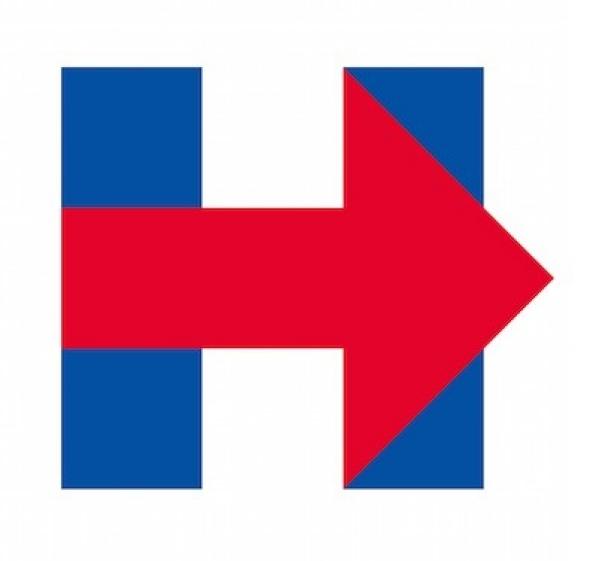
The logo in question (pictured above) features a bold blue letter “H” crossed by a red arrow pointing right. The colors and design were perhaps chosen to signify bipartisan unity and appeal to younger voters. The logo design avoids the traditional patriotic symbolism found in campaign designs of the past.
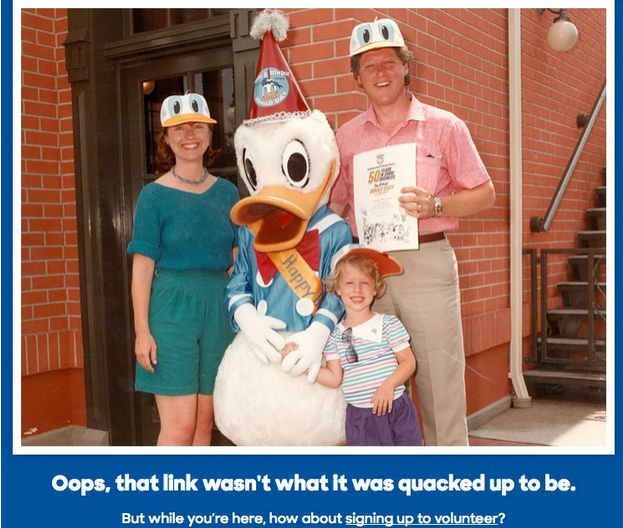
While the campaign logo may not be personable enough, her 404 page sure is.
Importance of Design
Whether for a business or personal use, choosing the right logo is extremely important. There are tons of logos out there, making it hard to differentiate and be original. It is challenging to create a logo that is instantly recognizable to the desired or intended audience.